Project Context
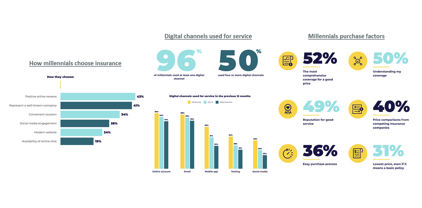
Kaus Insurance, with over 30 years in the industry, traditionally sold their insurance through regional agents rather than directly to consumers. However, with the increasing preference of younger consumers to purchase insurance online without intermediaries, Kaus needed a way to offer optimized packages and simplify the insurance selection process for these digital-savvy clients.

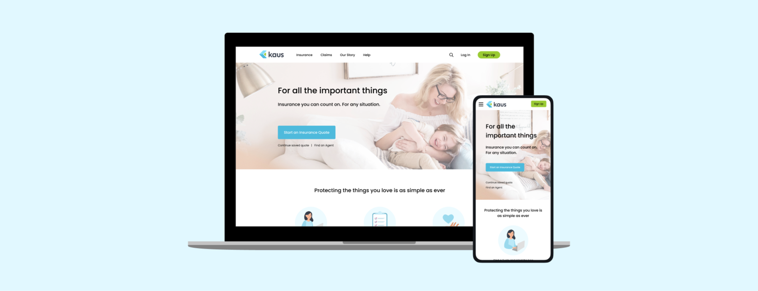
The goal of this project was to assist Kaus Insurance with rebranding and developing a new responsive e-commerce website. This platform would enable individuals to purchase insurance at any time. Users would have the ability to easily learn about insurance, search for personalized options, and ultimately choose a suitable package to purchase.
This led us to ask “How might we allow individuals to search for and purchase insurance online?”
Solution
To address Kaus Insurance’s need to transition from traditional sales through regional agents to a digital-first approach, a user-centered, responsive e-commerce platform was developed. The design process involved extensive UX research to understand the target demographic’s preferences, followed by the creation of wireframes and prototypes that emphasized intuitive navigation and an optimized insurance selection process.
The platform’s responsive design ensures a seamless experience across devices, while the integration of a personalized search function and recommendation engine allows users to easily find and purchase tailored insurance packages. Additionally, educational content was incorporated to guide users, and the checkout process was streamlined for efficiency and security. Post-launch, the platform will undergo continuous iteration based on user feedback to ensure ongoing improvement and customer satisfaction.
Success impact
Launch and User Adoption:
- Launched in March 2023 after a successful beta phase.
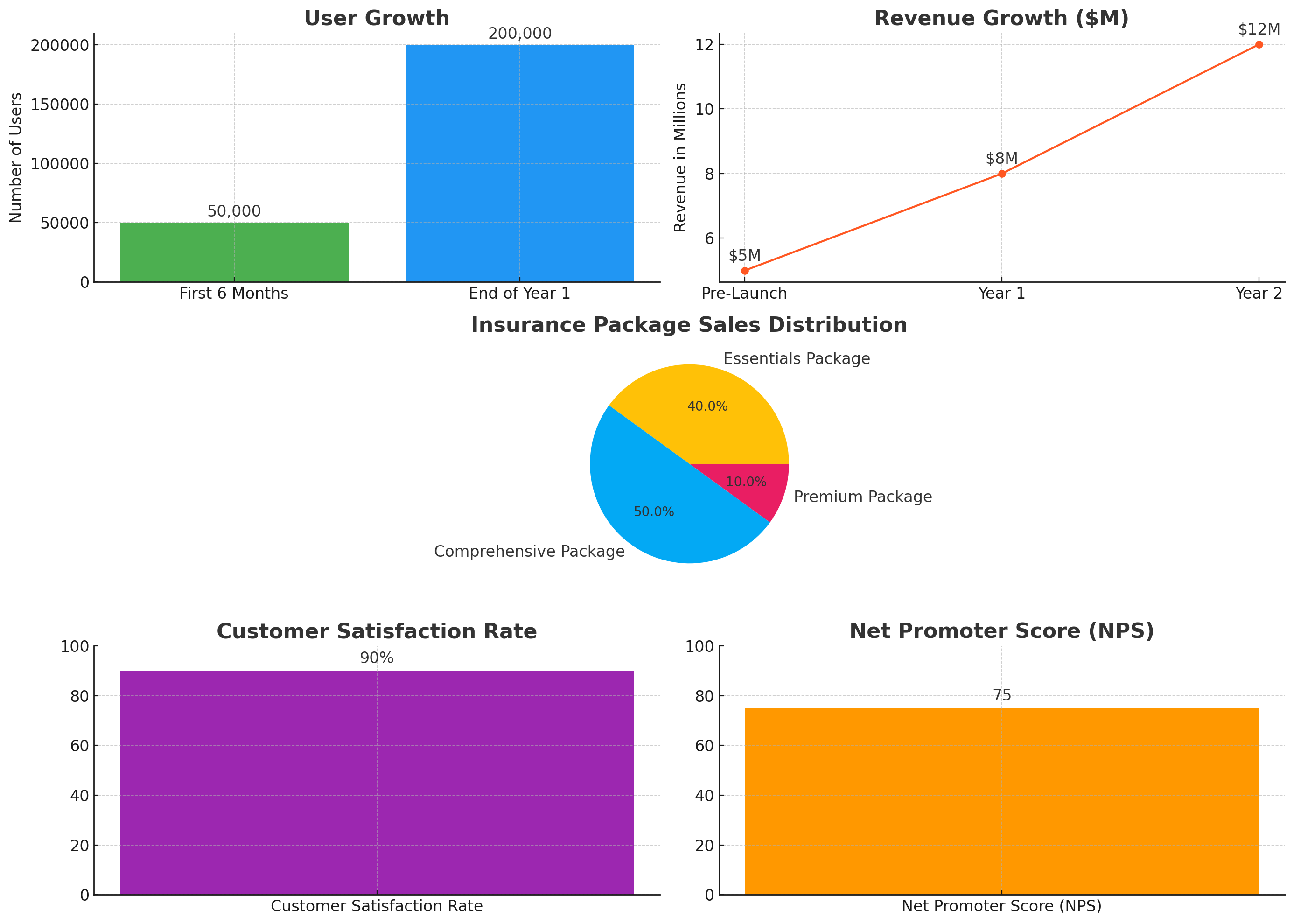
- Over 50,000 users engaged within the first six months.
- Active users grew to 200,000 by the end of the first year, driven by targeted marketing and word-of-mouth.
Revenue Growth:
- Pre-launch revenue averaged $5 million annually.
- First-year revenue increased by 60%, reaching $8 million.
- Second-year revenue climbed to $12 million, doubling pre-launch earnings.
User Engagement and Packages:
- 70% of site visitors completed an insurance purchase.
- Essentials Package: Basic coverage, 40% of sales.
- Comprehensive Package: Extensive coverage, 50% of sales.
- Premium Package: High-end coverage, 10% of sales.
Customer Satisfaction:
- 90% user satisfaction with the online purchase experience.
- Net Promoter Score (NPS) of 75, indicating strong customer loyalty.
My role
Role: UX/UI Designer
Timeline: Mar 2022 – July 2022
Methods & Tool: User Interviews, Market Research, Competitive Analysis, Empathy Map, User Persona, Storyboard, Usability Study, Affinity Map, User Flow, Site Map, Wireframes, UI, Figma, Photoshop, Ilustrator, Excel
Process
Followed UCD process throughout the project
Our task was to design the end-to-end experience for users to search for and select a personalized insurance package. We began with the assumption that insurance is a complicated and confusing subject for many users. Following a user-centered design process, we validated this assumption through user research, then shaped the solution by defining key user interactions and continuously testing and iterating on the designs.
Research & Define
Understanding the user and problem space
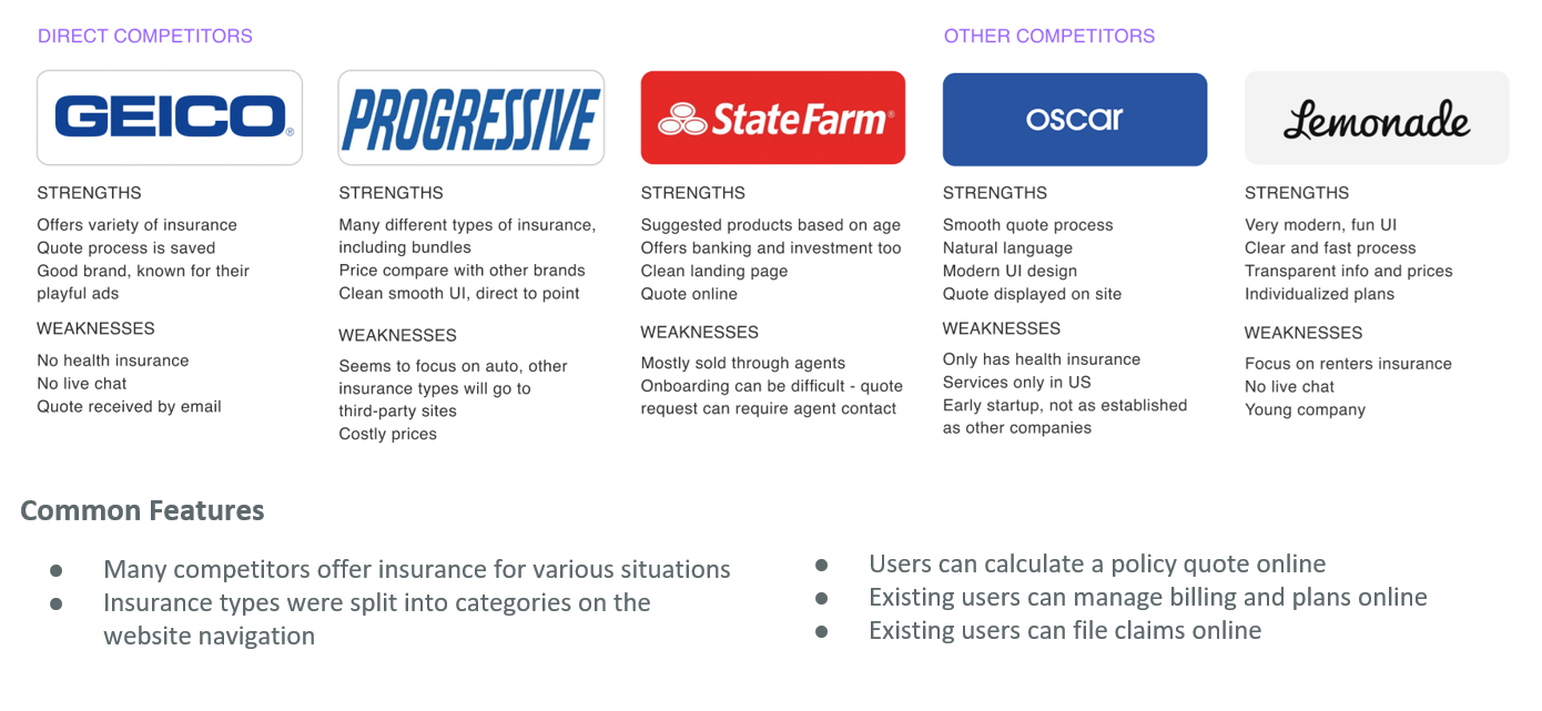
The first phase consisted of research and user discovery. Although Kaus Insurance had clear design objectives, our research was essential to shaping the overall user experience. We conducted market and competitive analysis to understand how insurance is currently sold online and to identify areas for improvement. This approach aligns with the user-centered design process, ensuring that our design decisions are guided by user needs and market insights.
Research Goals
In order to design an effective solution for Kaus, we conducted research to better understand the insurance industry and learn about how users purchase insurance. The following goals were outlined to guide our research:
1- Understand user behavior and decision-making process regarding insurance buying
2- Understand how customers research and find insurance
3- Uncover current pain points that customers experience when looking for insurance
4- Analyze Kaus’ competitors
5- Find out how online insurance is sold today, and identify areas of improvements
Market Research Findings (1/2)
Key Statistics
– The average insurance customer engages with their insurer only 1-2 times a year
– In 2021, 12.5% of non-elderly adults were uninsured. 8.8% of all people were uninsured. – 3 in 5 (60%) of insurers are using tech to build products/services to boost engagement, 35% planning to in 2020
– Health insurance is the fastest-growing segment. Takes up 23% of global insurance premiums. In 2017 the industry achieved 5% YoY growth.
Market Trends
– There’s a trend in the rise of Insurtech – with technology, AI, chatbots, and smart apps, many insurance startups are using this technology and disrupting the traditional insurance market.
– There is an increased focus on personalized premiums and usage-based coverage, rather than one-size-fits-all insurance. New tech such as AI and smartapps are used to determine personalized risk profiles.
Market Research Findings (2/2)
Competitive Analysis
User Interviews
6 participants were interviewed about their insurance experience. The participants varied in gender and were between the ages of 24-64 years. All participants also had past experience purchasing insurance of some kind. The interview consisted of questions on their insurance experience, buying process, and general opinions on insurance.

Key Statistics
– Those who purchase insurance do so to protect their way of life and bring peace of mind
– Users tend to search online and ask people they know for opinions and recommendations when choosing their insurance company
– Users value reliability and simplicity in company processes, from getting a quote to filing a claim
– Upselling from agents was a common pain point across all interviewees
Synthesize
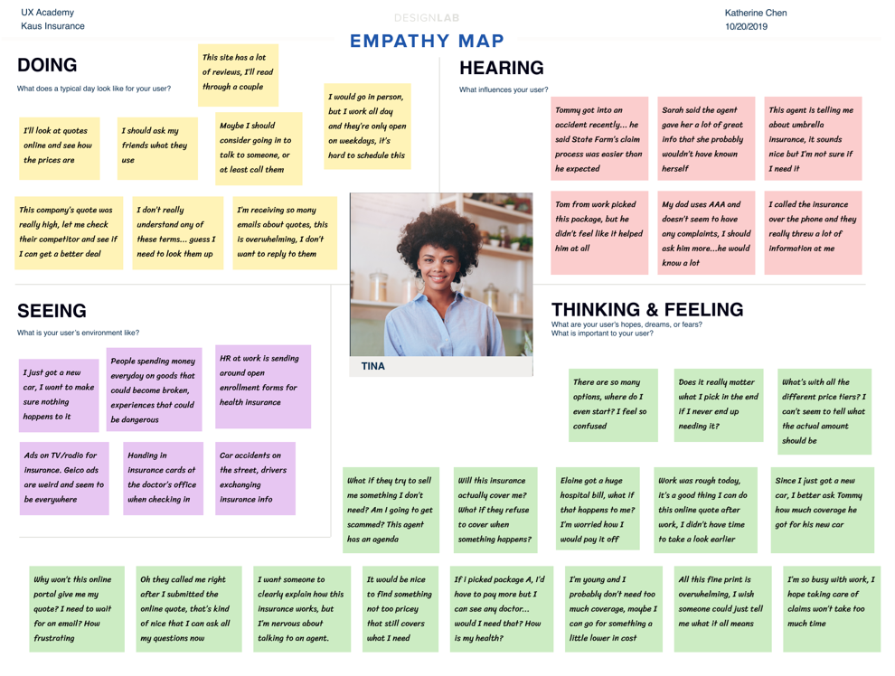
Empathy Map
Based on our research findings, an empathy map was created to better understand and visualize our user’s needs. The map gives us deeper insight into the target user and the aspects of insurance that pertain to them.
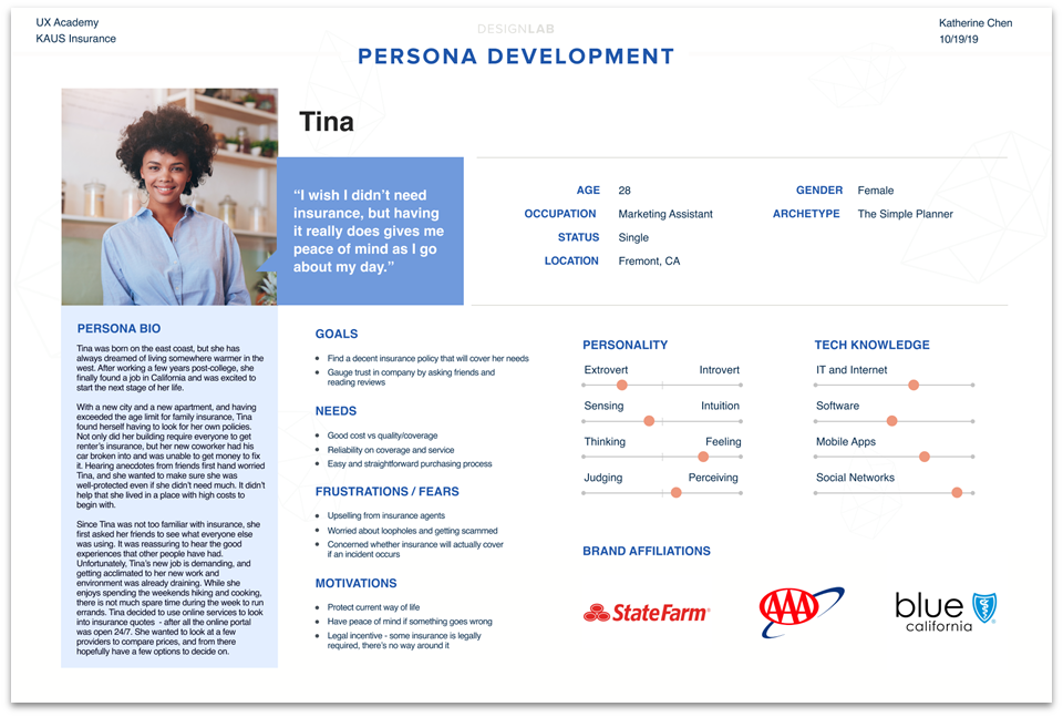
User Persona
Research findings were synthesized to create our target user persona – Tina. This persona was used throughout the product design and usability testing phases to ensure we were addressing the user’s needs, wants, and limitations.
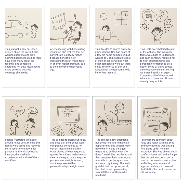
Storyboards
Two storyboard outlines were sketched to complement our understanding of the user persona, and how our solution might solve current problems that users face during their day.
Define
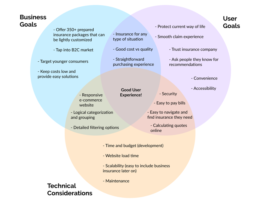
Defining Strategy
To prepare ourselves for the next phases in the design thinking process, we outlined Kaus’ business goals, our users’ goals, and technical considerations that must be accounted for in our development. The completed diagram allowed us to fully determine our solution’s feature list and prioritize them.
How might the user search for different types of insurance?
Given that Kaus prides itself on offering “packages for any situation,” it was crucial that users could locate the specific type of insurance they needed among the myriad of options. To organize the sitemap and navigation for insurance searching, we conducted an in-person open card sorting activity. Participants grouped different types of insurance into categories they perceived as logical.
Surprising card sorting findings
– There was user consensus only among insurance types for health, auto, or property-related insurance
– There was confusion over whether life insurance was health-related or not Participants would debate over whether a certain type of insurance was deemed essential or not
– Labeling insurance was a challenge for many participants
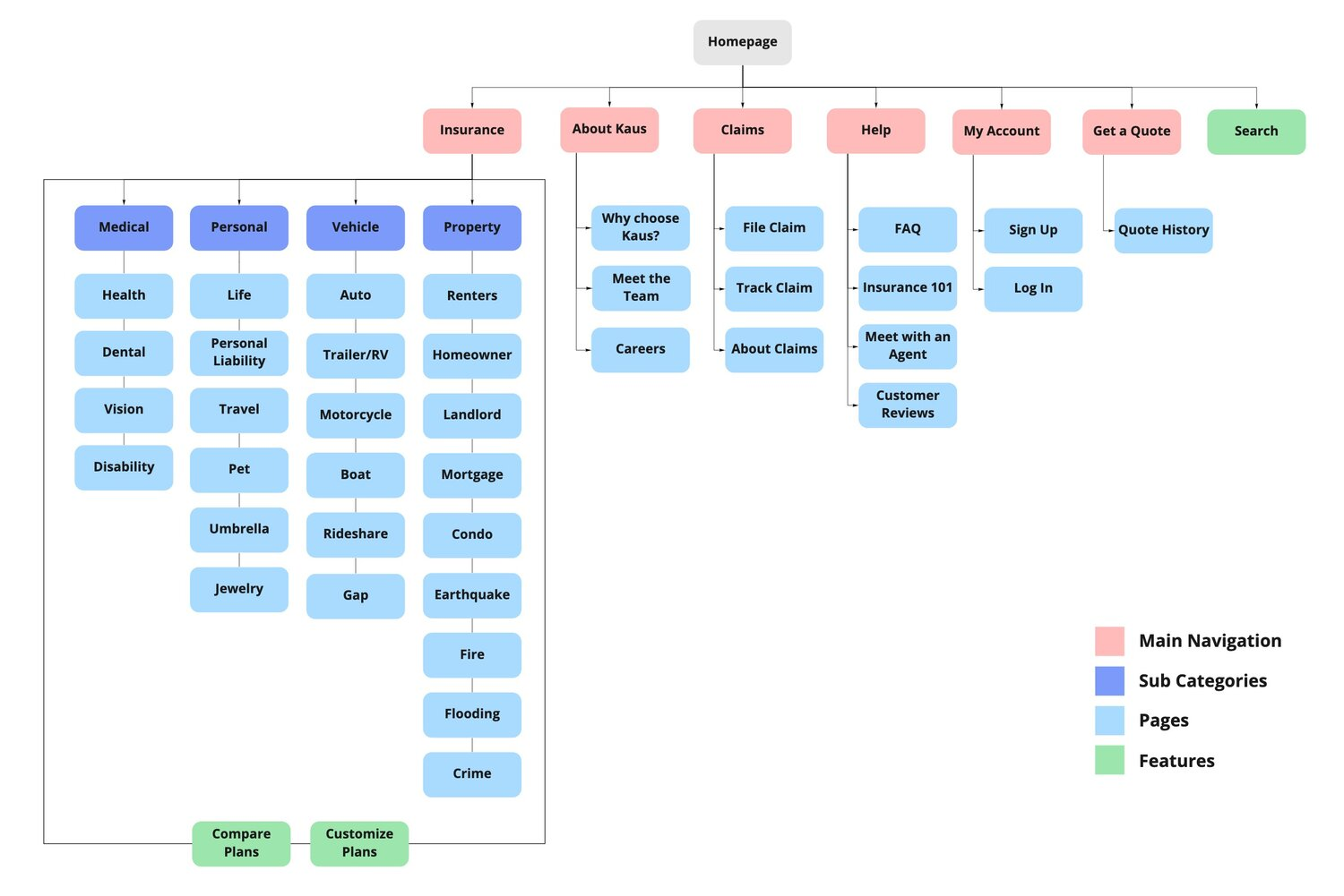
Sitemap
The sitemap lays out the foundation of our site. We created the insurance categorization based on data from the card sorting exercise. Taking into consideration our market and user research, the rest of the sitemap included pages and features that would be useful to users.
Design & Iteration
Sketches
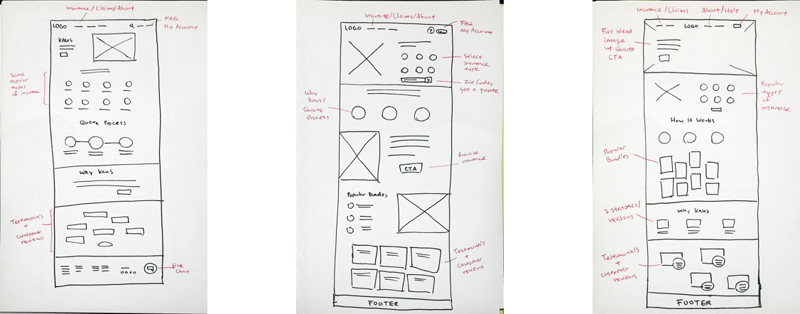
Before diving into digital wireframes, we looked at other insurance websites, e-commerce sites, as well as some general homepage layouts to generate these sketches and ideas for Kaus. These hand-drawn sketches lay out some preliminary landing page concepts. The completed diagram allowed us to fully determine our solution’s feature list and prioritize them.
Wireframes
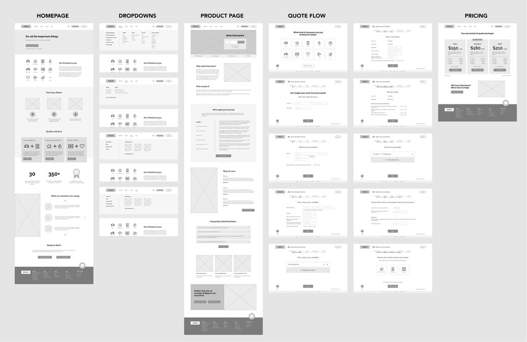
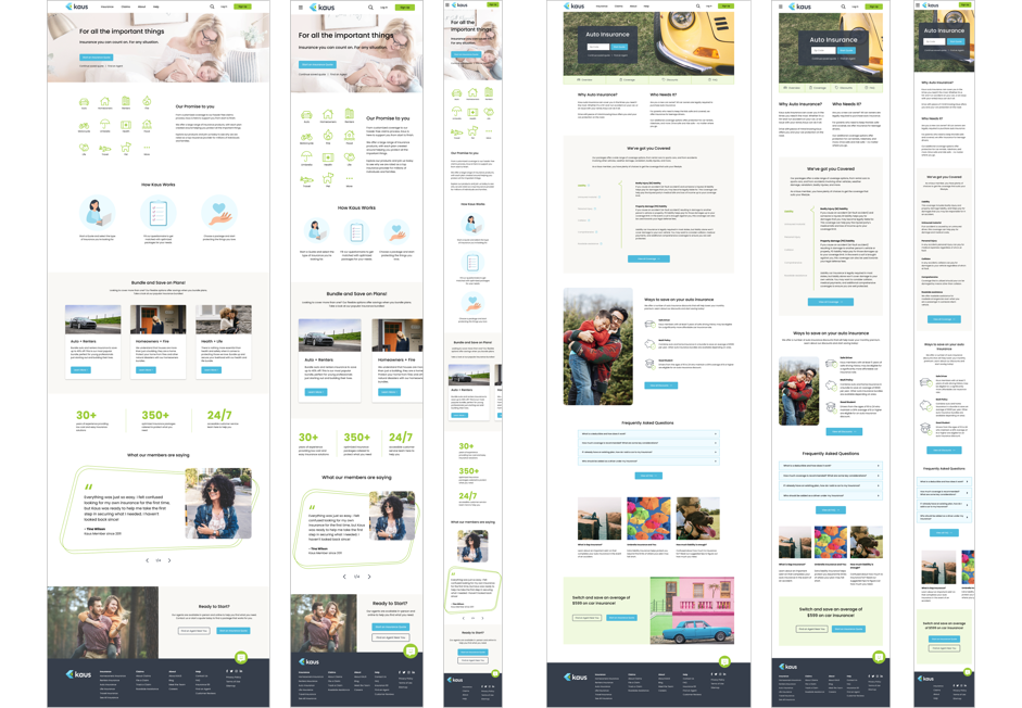
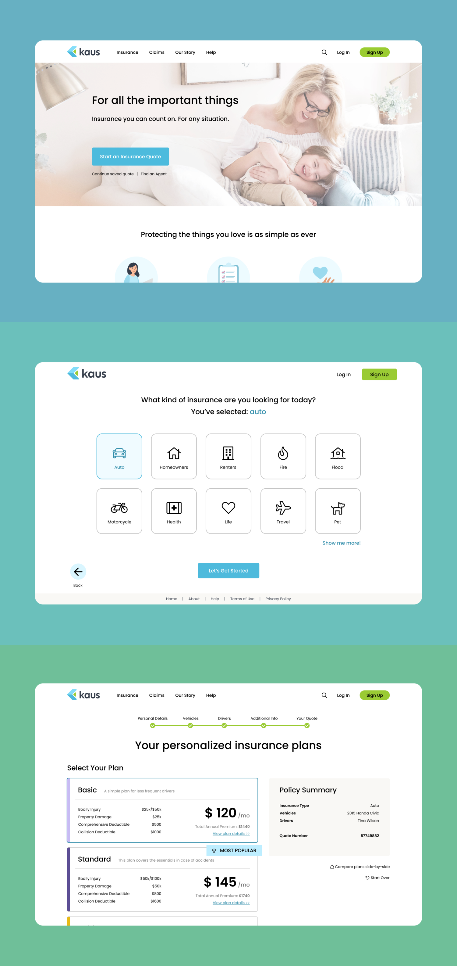
From the sketches, a final landing page was designed that would effectively allow users to view Kaus’ product offerings and complete their goals. Additional pages and elements were also developed and wireframed to fully allow for a typical user task flow of searching for and purchasing insurance. The completed diagram allowed us to fully determine our solution’s feature list and prioritize them.
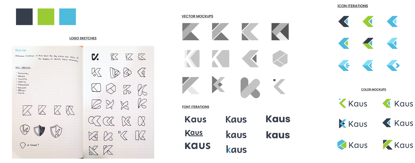
Kaus Logo Exploration & Brand Identity
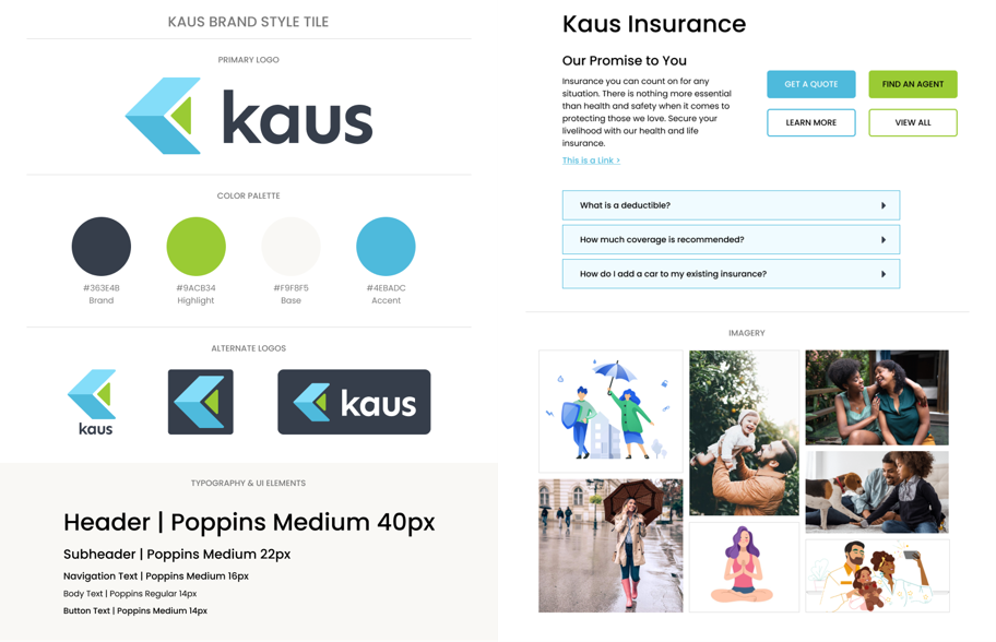
One of Kaus’ top priorities was to rebrand their image and redesign the logo. With this in mind, various sketches and designs were explored to find a suitable representation of Kaus’ new direction. The final logo design was paired with typefaces, a color palette, sample UI elements, and imagery to flesh out Kaus’ brand identity. We developed a style tile to bring together these brand elements, ensuring consistent UI design in the following processes.
Usability Testing
A prototype was tested to uncover critical issues in the design. The main goals of usability testing were to test the level of ease with navigation, identify any bottlenecks, and observe the paths that users took to complete each flow. The test was conducted with participants of varying levels of insurance experience to ensure that the website would be easily understood by all users.
Results from the test revealed three big insights:
– The proximity of the insurance icons were very alluring to users, and enticed more user action than the navigation bar itself.
– The icons’ visual dominance overpowered main call to action buttons, creating unnecessary steps when starting a quote flow.
– Features meant to reduce users’ mental load, such as insurance plan filters, were not visually recognized.
Based on feedback collected from usability testing, the following priority revisions were made:
– The homepage CTA was made more prominent to reduce confusion on how to start a quote.
– Filter and bundle features were built out following common patterns to ensure users can easily find the plan they need to.
– Copy was revised to maintain consistent and understandable language throughout the site.
Reflections
Working on Kaus taught me a number of skills for designing and branding from the ground up, from conducting multiple methods of research, analyzing insights and relevant data, defining and strategizing on optimal user experiences and content architecture, to finally building consistent UI.
I learned that pre-existing assumptions and hypotheses on user behavior are best validated early on in the design process to avoid reworking and inefficient decision-making. The end result was a web experience that took into account users’ specific needs surrounding insurance, while also focusing on the digital aspect of purchasing an intangible insurance product.
