Project Context
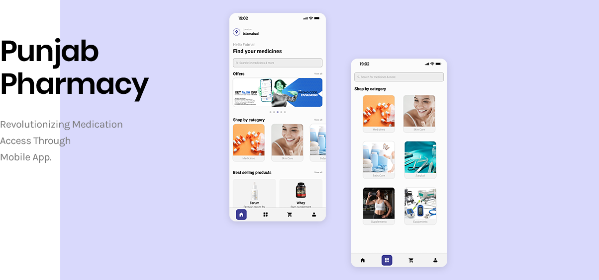
“Punjab Pharmacy App is your go-to destination for a seamless and convenient pharmacy shopping experience. We understand the importance of health and well-being, and our app is designed to make accessing essential healthcare products easy and efficient.”
Project Statement
The current pharmacy shopping experience lacks convenience, accessibility to professional advice, and personalized recommendations for users. Customers often struggle to find alternative products, miss out on special offers, lack real-time communication with pharmacists, and face challenges in tracking their orders. Additionally, there is a need for dedicated sections for gym supplements and baby care products to cater to specific user requirements.
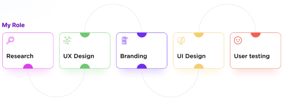
As the project lead, I spearheaded the research and finalized the UX design. I crafted the UI and established the visual language for the app, ensuring a cohesive and user-centric experience.
Solution
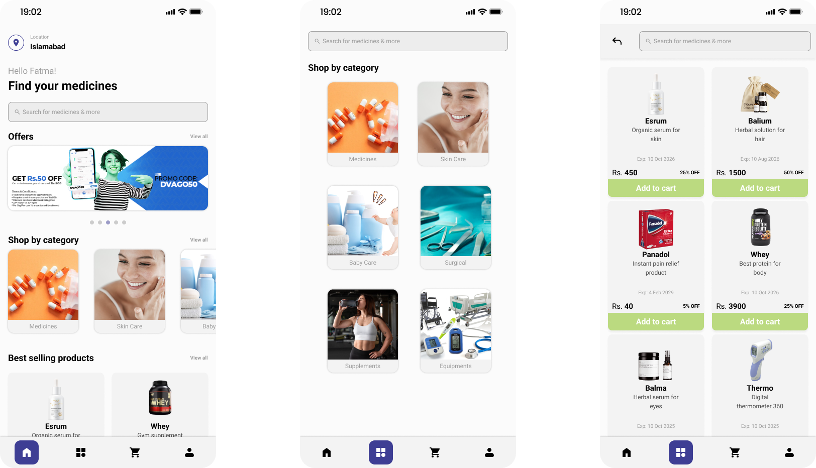
To address the challenges in the current pharmacy shopping experience, I led a comprehensive redesign of the app, focusing on enhancing convenience and accessibility. The solution involved integrating real-time communication with pharmacists, enabling customers to receive professional advice and personalized product recommendations.
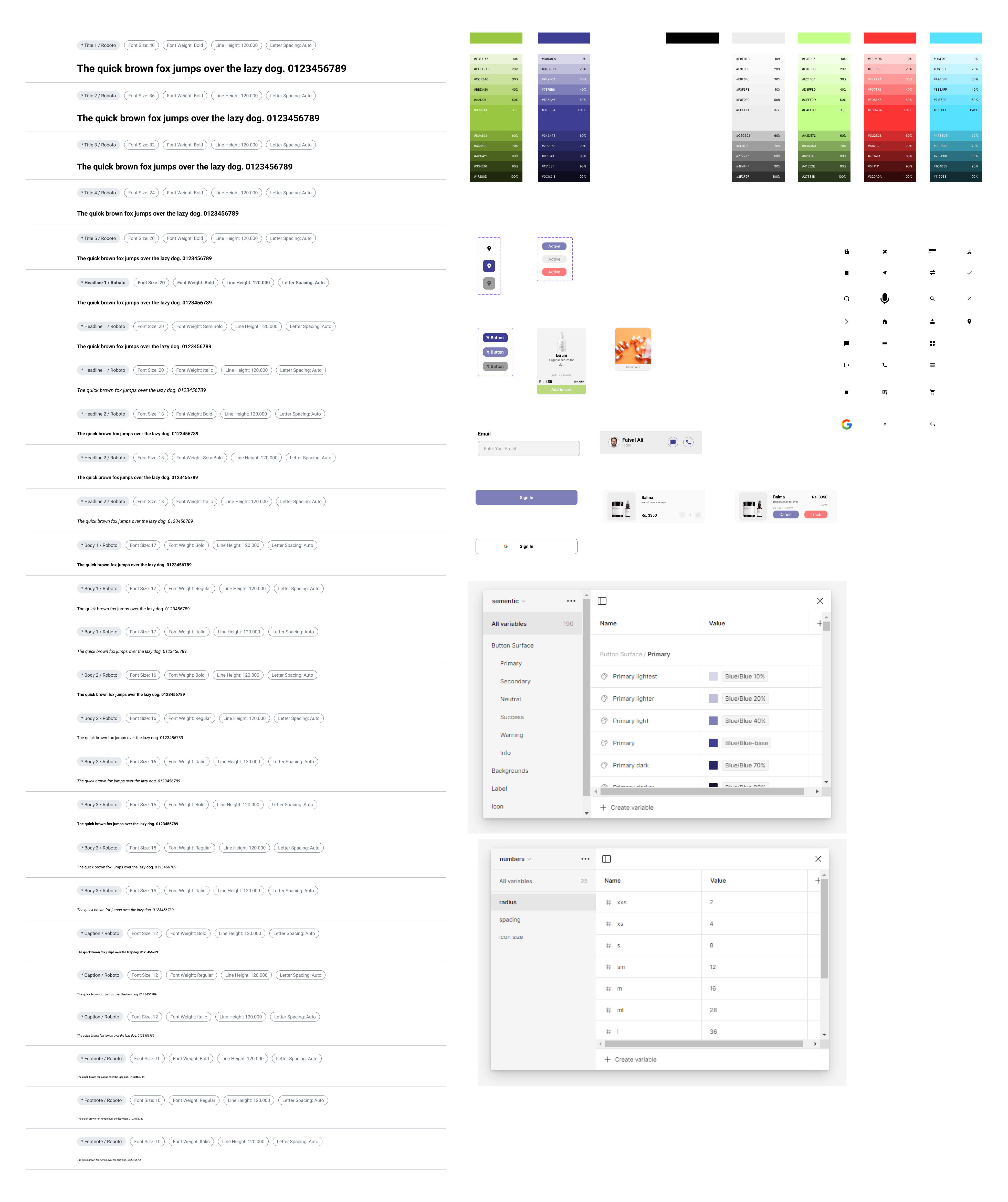
I implemented features for easy navigation and discovery of alternative products, and ensured users could effortlessly track their orders. Special offers were highlighted, and dedicated sections for gym supplements and baby care products were introduced to meet specific user needs. I also crafted the UI and established a cohesive visual language, ensuring a seamless and user-friendly experience throughout the app.
Update
The app is not live yet. However, the product has been handed over to the client.
My role
Process
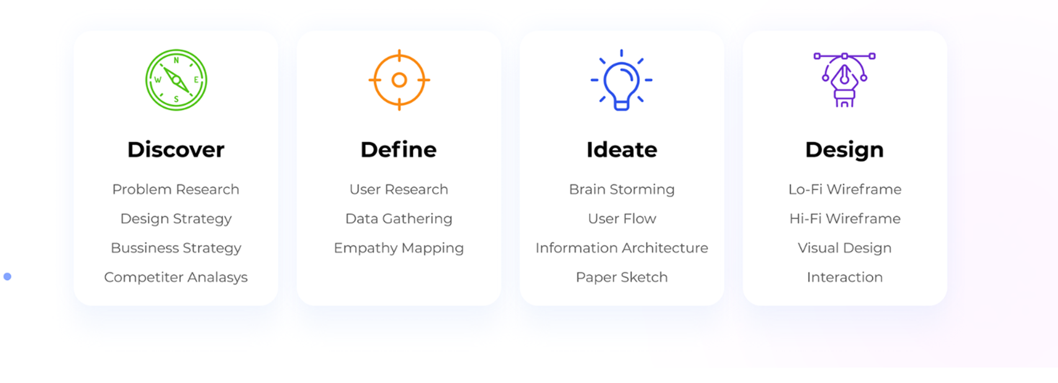
Follow UCD process throughout the project
While working on the app, we went through various stages of the user-centered design process, focusing on the users and their needs at every stage. We engaged users throughout the design process using a variety of research and design techniques to create highly usable and accessible products for them.
Discovery
Understanding the user and problem space
During the research phase of designing pharmacy app for our client, our team conducted a comprehensive study to thoroughly understand the pharmacy experience. This involved analyzing user demands, the range of products offered, and the intricacies of business and sales within the pharmaceutical industry. We meticulously examined the existing physical systems to identify essential functionalities and features that should be incorporated into the app. Our objective was to enhance user convenience and operational efficiency through innovative and user-centric design solutions.

Research goals and findings
To design an effective pharmacy mobile app for our client, we conducted in-depth research to understand the pharmaceutical industry and user behavior. Our research goals were:
1- Understand User Behavior and Decision-Making Process: Analyze how users decide on purchasing medications and pharmacy products. A 2023 survey revealed that 65% prioritize convenience, and 30% value personalized services.
2- Understand How Customers Research Pharmacy Products: Examine methods customers use to find pharmacy products. Data shows 78% rely on online reviews and search engines, with 55% using pharmacy mobile apps.
3- Identify Pain Points in Finding and Selecting Pharmacy Products: Identify common issues customers face. Findings indicate 42% are frustrated with long wait times, and 37% find navigating websites and apps difficult.
4- Analyze Competitors: Study competitors to understand their strengths and weaknesses. Leading apps like GoodRx and CVS have streamlined interfaces but lack personalized engagement features.
5- Evaluate Online Pharmacy Sales and Improvement Areas: Investigate current online sales practices. 68% of transactions are via mobile apps, highlighting a need for better user interfaces and medication management tools.
Target group
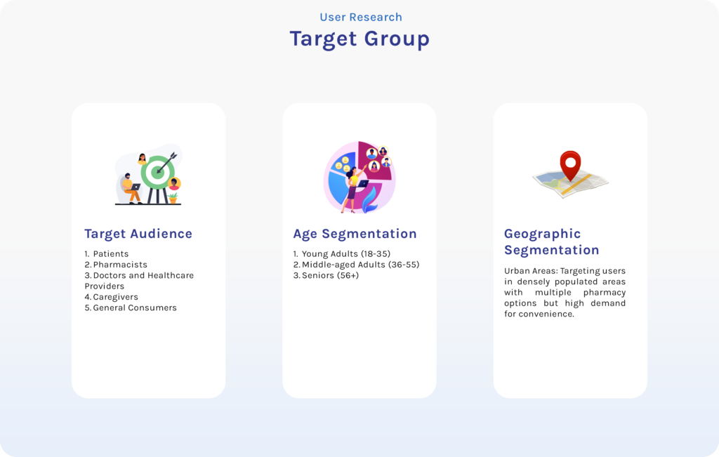
To identify the right target audience for our pharmacy mobile app, we employed a range of research methodologies and tools. We began with online surveys via Google Forms and SurveyMonkey to gather quantitative data on user behaviors and preferences. In-depth interviews and focus groups conducted through Zoom, Microsoft Teams, and in-person sessions provided qualitative insights into pharmacy experiences.
This comprehensive research enabled us to segment our audience based on demographics and preferences, ensuring the app meets their needs. A continuous feedback loop allows ongoing refinement, keeping the app relevant and user-centric.
Competitor Analysis
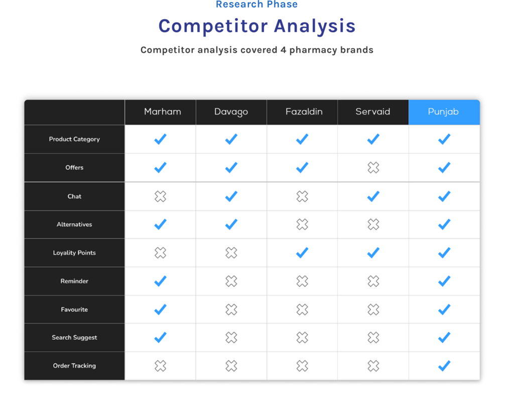
We analyzed Marham, Fazaldin, Servaid, and Davago. Marham offers robust telehealth but needs better delivery; Fazaldin provides excellent customer service but has long order wait times; Servaid has a strong presence but lacks personalized features; and Davago focuses on affordability but needs a better user interface and real-time inventory updates.
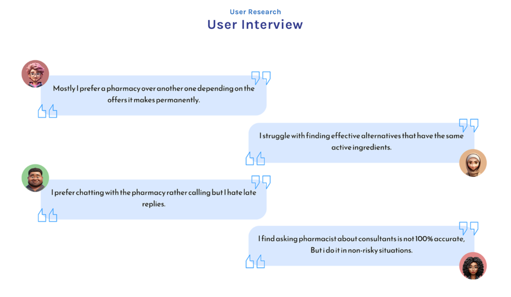
User Interview findings
Synthesize
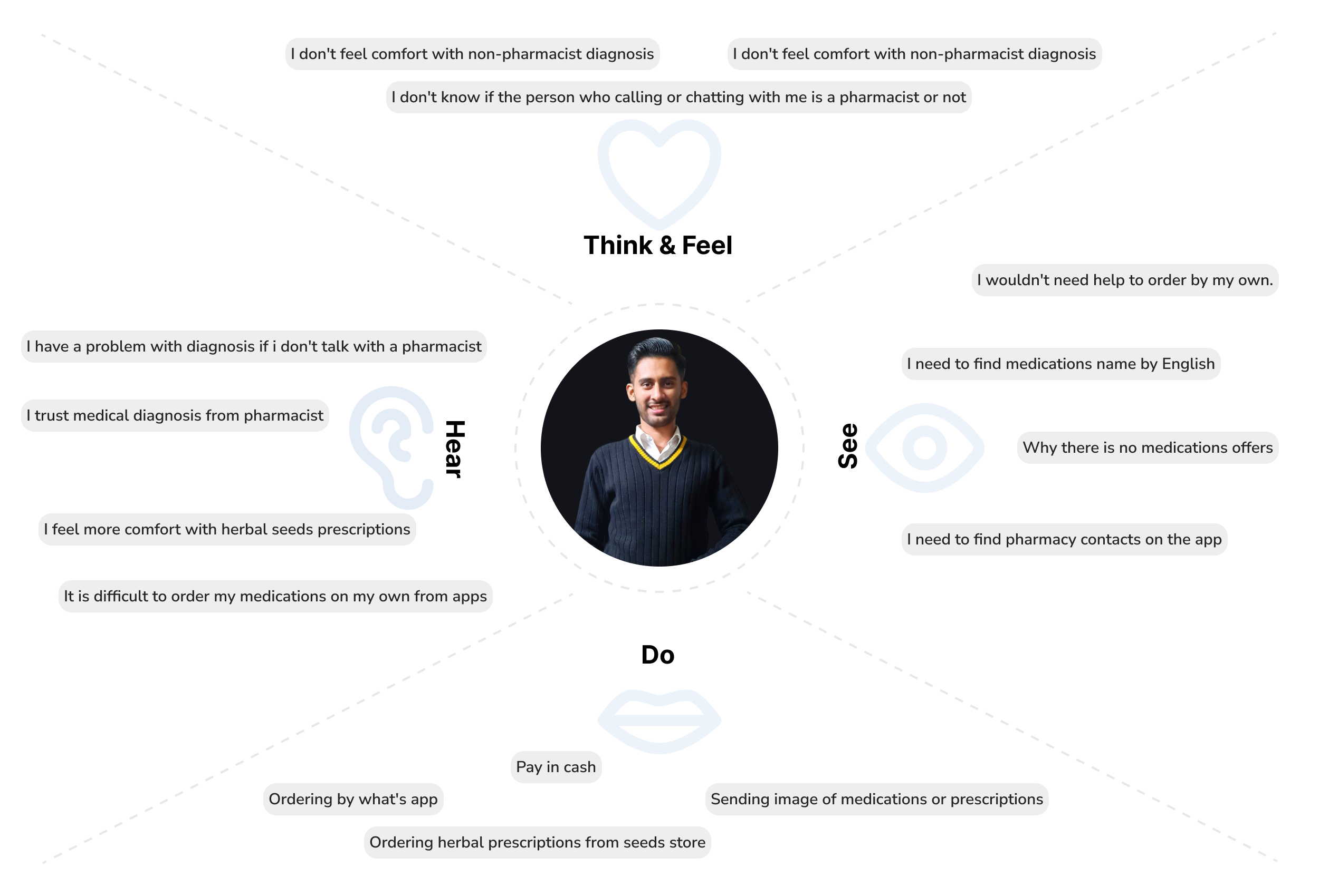
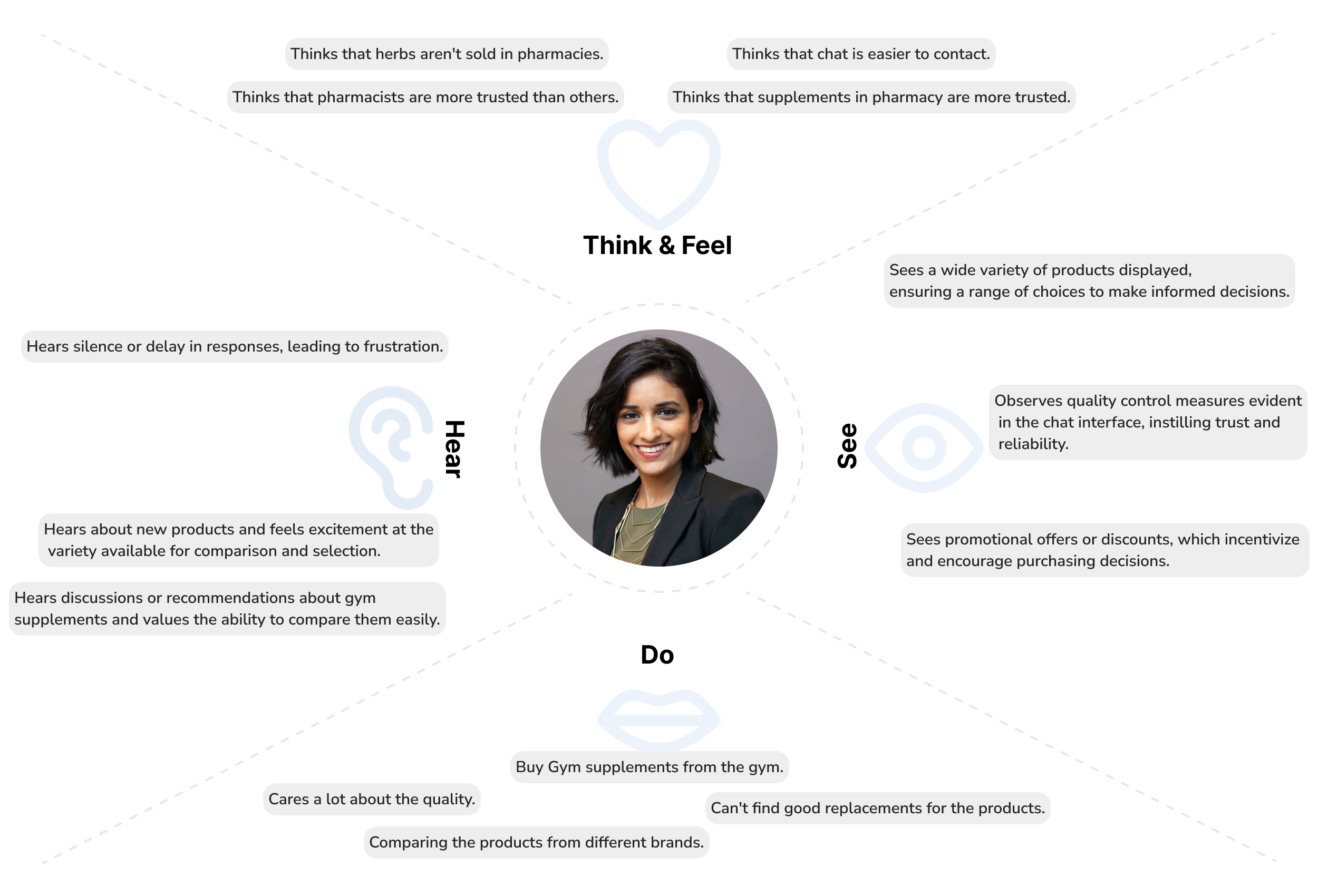
Empathy Map
Based on our research findings, an empathy map was created to better understand and visualize our users’ needs. The map gives us deeper insight into the target user and the aspects of insurance that pertain to them.
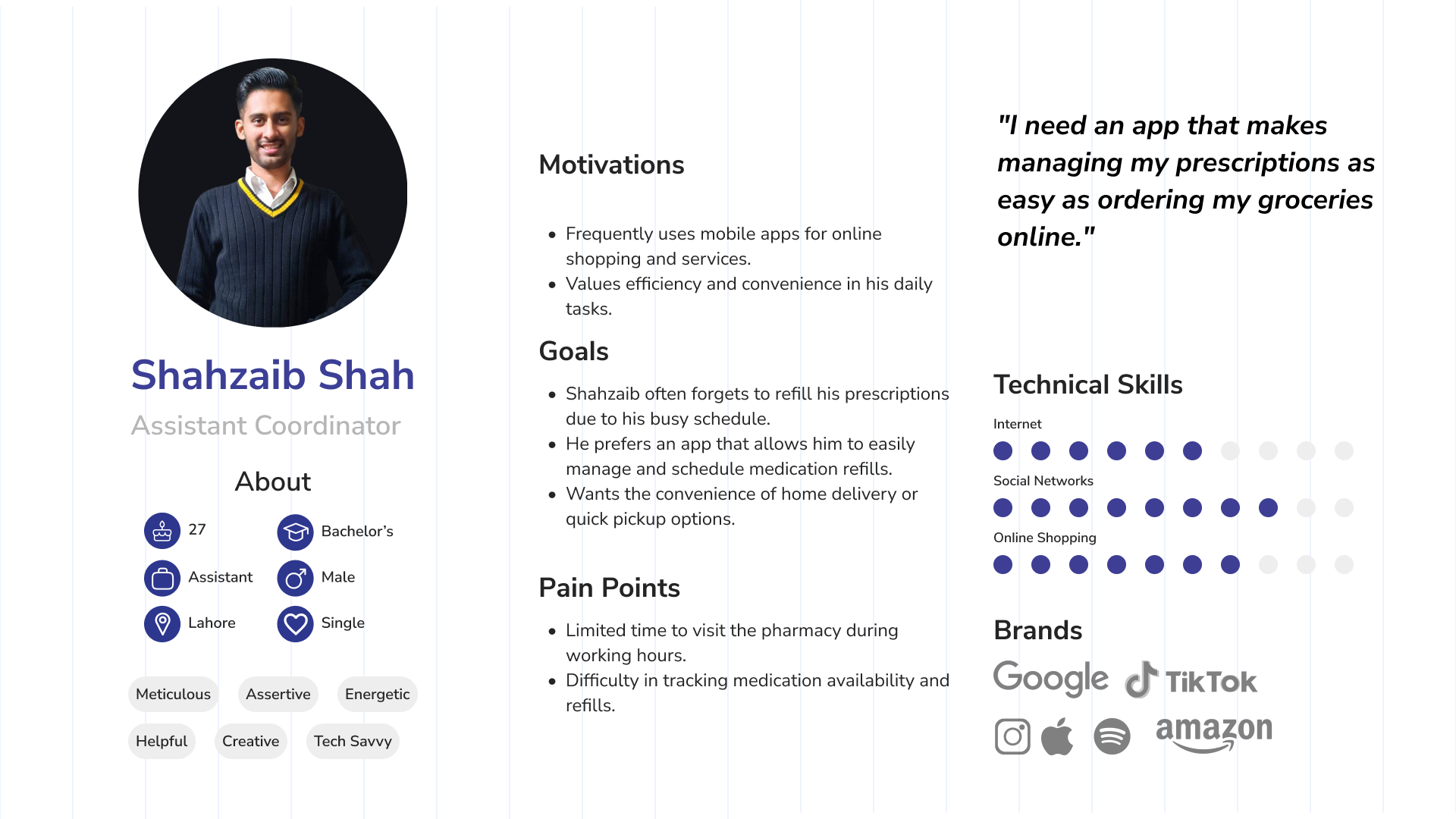
User Persona
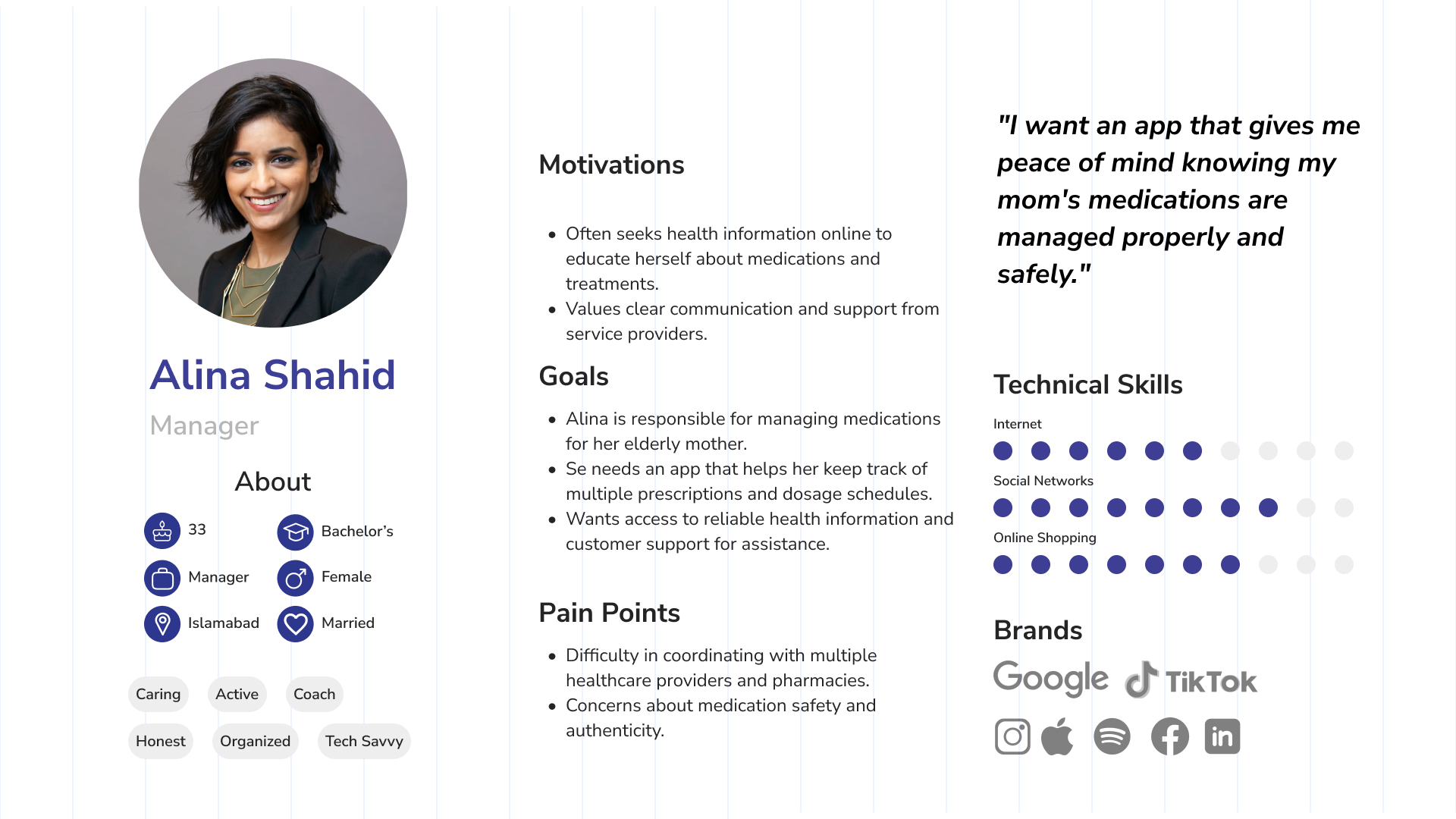
Research findings were synthesized to create our target user persona – Shahzaib Shah and Alina Shahid. These persona was used throughout the product design and usability testing phases to ensure we were addressing the user’s needs, wants, and limitations.
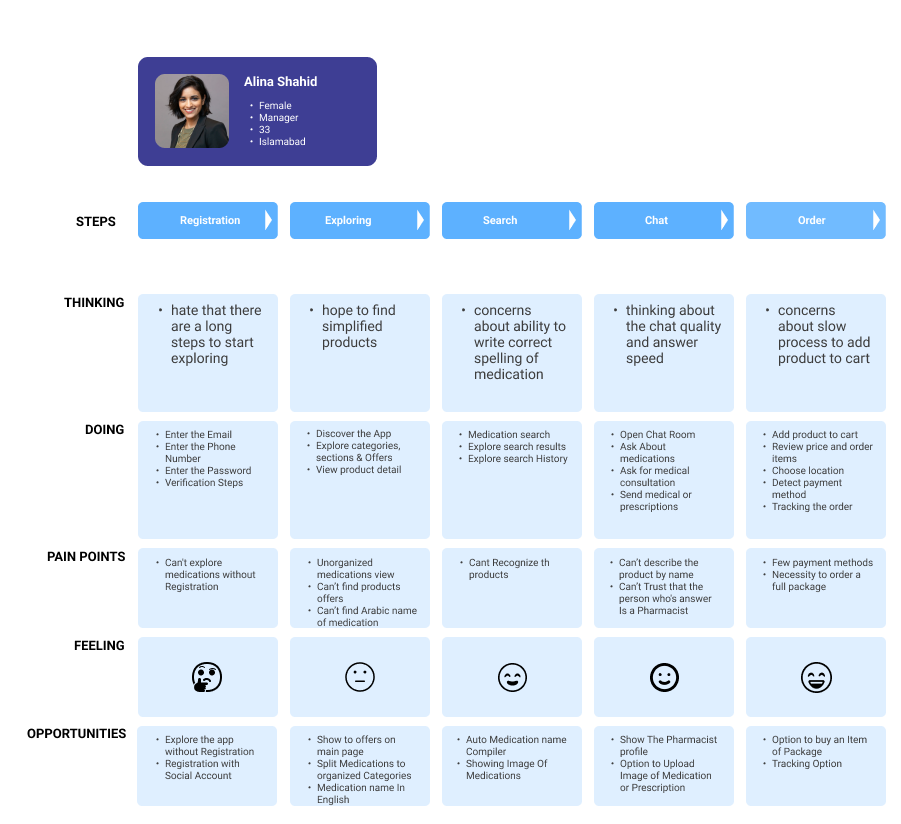
User Journey Map
Define
Card Sorting
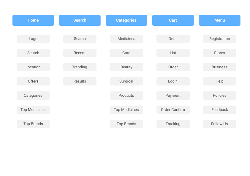
Card sorting was essential in enhancing the pharmacy shopping experience by revealing how users naturally organize information. By observing user categorization of items and features, we developed a user-friendly navigation system that makes finding medications, alternative products, gym supplements, and baby care items easy. Insights from card sorting aligned the app’s layout with user expectations, improving usability and reducing frustration.
We prioritized content and functionality based on user preferences, focusing on real-time communication with pharmacists, personalized recommendations, quick refills, and special offers. Clear and intuitive labels for app sections were identified, ensuring confident navigation. Additionally, opportunities for customization, such as personalized health tips and medication reminders, were discovered, enhancing overall user engagement and satisfaction.
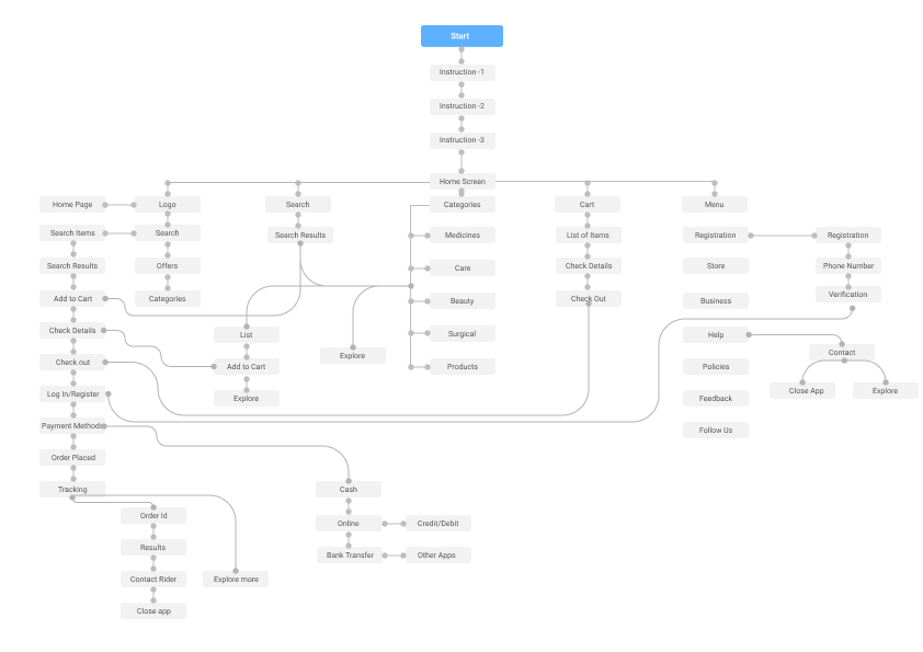
Information Architecture
The information architecture of our pharmacy mobile app was meticulously crafted using insights derived from various research methods, including card sorting, user interviews, surveys, and competitor analysis. Here’s how these research findings shaped the app’s structure:
Design & Iteration
Wireframes
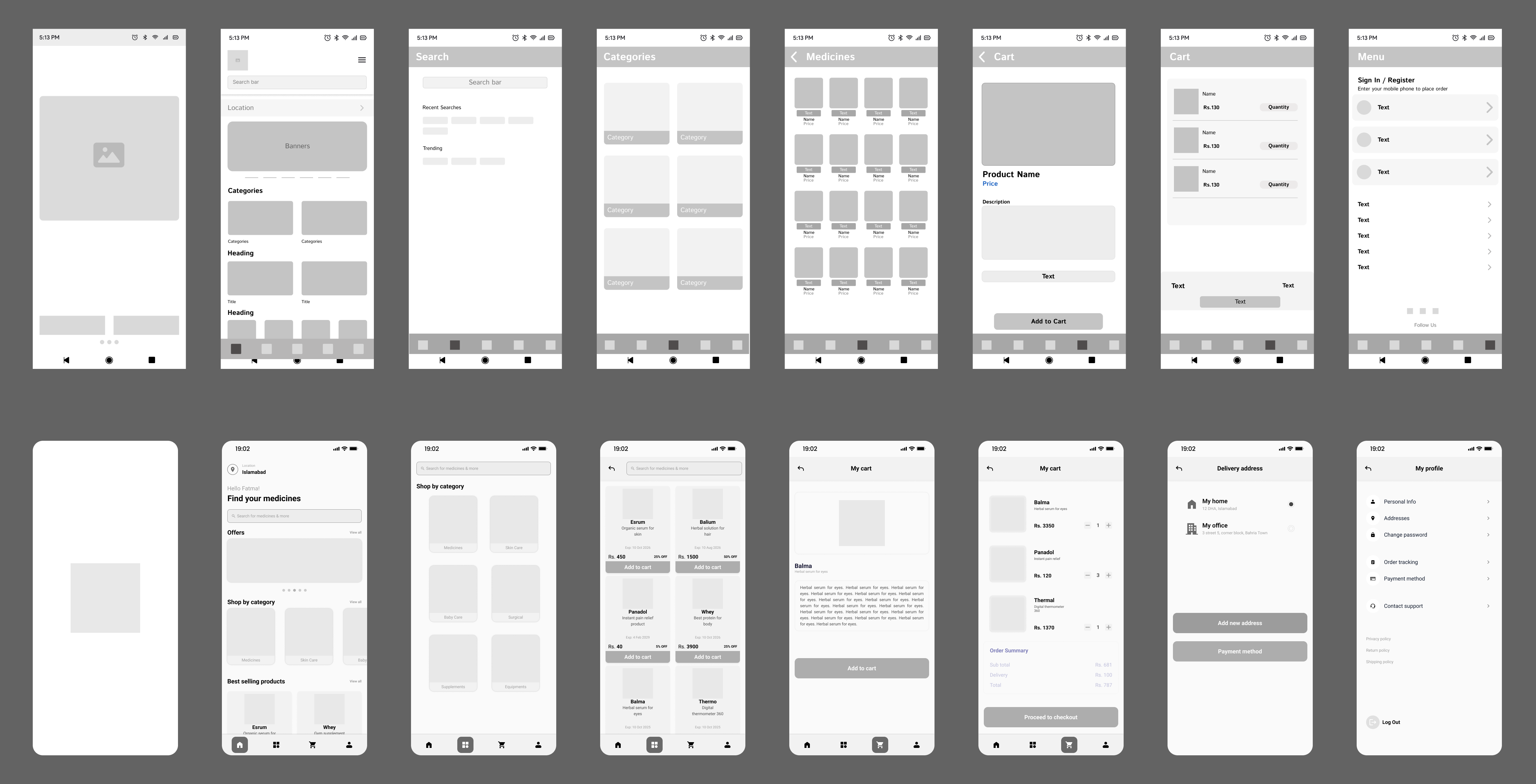
Two wireframes were created for the app and subjected to usability testing using the A/B method. This approach allowed us to compare user interactions and preferences between the two designs, helping us identify the most effective layout and features for the final app.

Reflections
It was a rewarding challenge that deepened my skills in user research, design, and collaboration. Leading the redesign allowed me to focus on empathizing with users and translating their needs into effective, user-friendly features like real-time communication and personalized recommendations. Balancing technical constraints with user experience taught me the importance of iterative design and continuous feedback. Establishing a cohesive visual language further enhanced usability and brand identity. This project was a key milestone, pushing me to innovate and deliver a solution that truly improved the pharmacy shopping experience.
